Film Poster Art
Miyazaki Poster Series
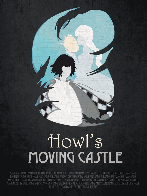
These posters were created as a graphic design project for one of my courses at Georgia Tech. Starting with hand drawings and developing them into digital designs, my group and I created these film posters of our favorite Hayao Miyazaki films. Utilizing simplified color schemes and a minimalist technique, we divided the design work to create a unified style.
Tools: Adobe Photoshop | Adobe Illustrator
Key Words: Layout | Drawing
Category: School
Tools: Adobe Photoshop | Adobe Illustrator
Key Words: Layout | Drawing
Category: School

|
|
|
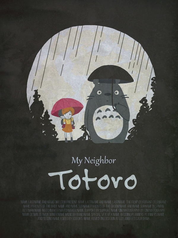
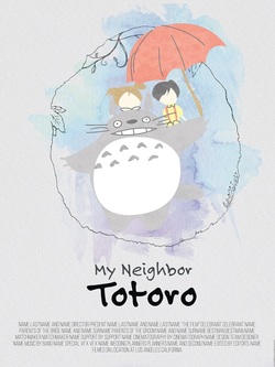 First iteration of the My Neighbor Totoro poster
Design Process
Defining Project Scope
The assignment for this project was to create a series of film posters with a common artistic theme that brings them all together. Because our team of designers had very unique strengths and aesthetic styles, we needed to figure out how to combine our personal tastes. We chose to recreate posters for Miyazaki's work with a minimalist style, and we divided the work flow to create the final designs.
Hand Sketches & Digital Finalization
In order to keep the element of the hand in our artwork, each design first was sketched out on paper. We then proceeded to redraw the sketches digitally with a drawing tablet. I designed the poster for Princess Mononoke from start to finish and worked on the digital rendition of the My Neighbor Totoro sketches. Once we created our images, we added texture and styled them to look like movie posters.
Design Critique & Iterations
We had the opportunity to receive feedback on our posters from our professor and our peers. We figured out that our first design for My Neighbor Totoro's background color broke the unity of the posters, so we created a new one with different colors.
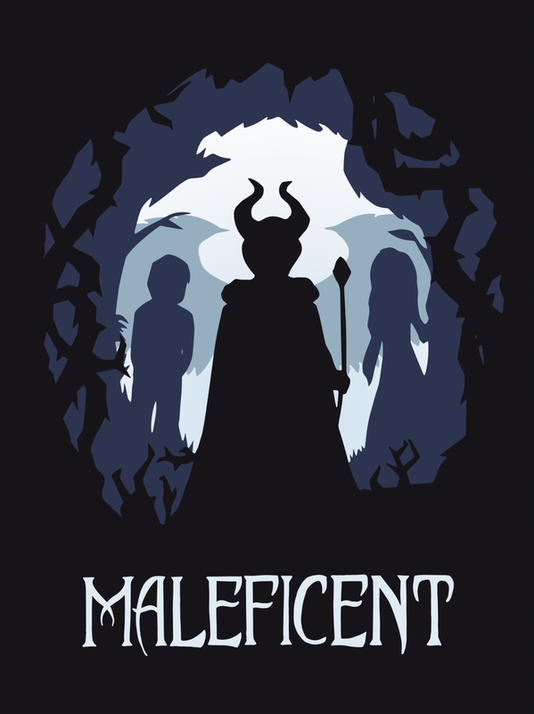
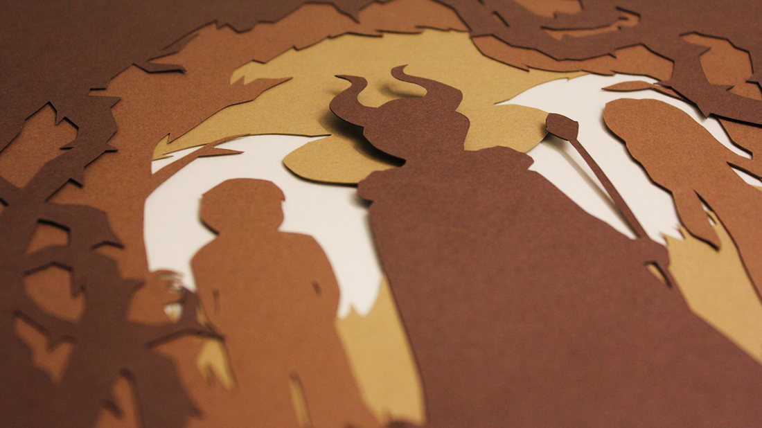
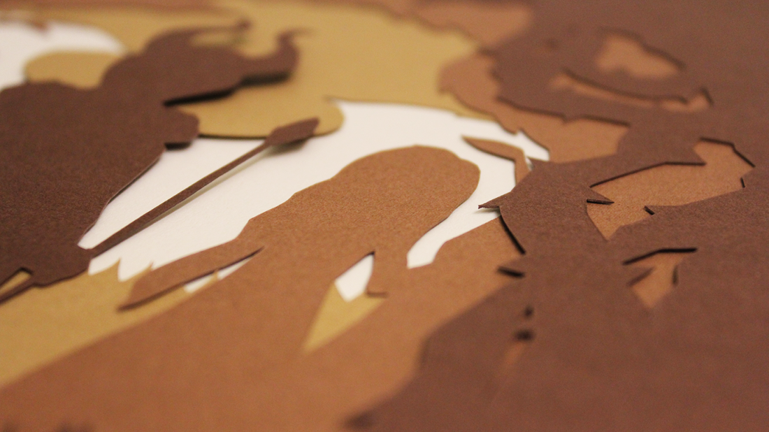
Maleficent Poster Design
This film poster is a graphical adaptation of the 2014 movie Maleficent that I made for a graphic design assignment.In order to include the element of the hand in my artwork, my process started out with the creation of physical layers with cardstock and an X-acto knife. I then scanned them into Photoshop and adjusted the colors to produce the finalized poster.
Tools: Adobe Photoshop
Key Words: Layout | Drawing | Paper Cutting
Category: School
Tools: Adobe Photoshop
Key Words: Layout | Drawing | Paper Cutting
Category: School